


Enterprise | B2B
A tighter table, a better overview, and 23% faster planning
Workforce planning and resource management for retail operations
Challenge
A B2B workspace for tracking workload, planning staffing, and managing resources
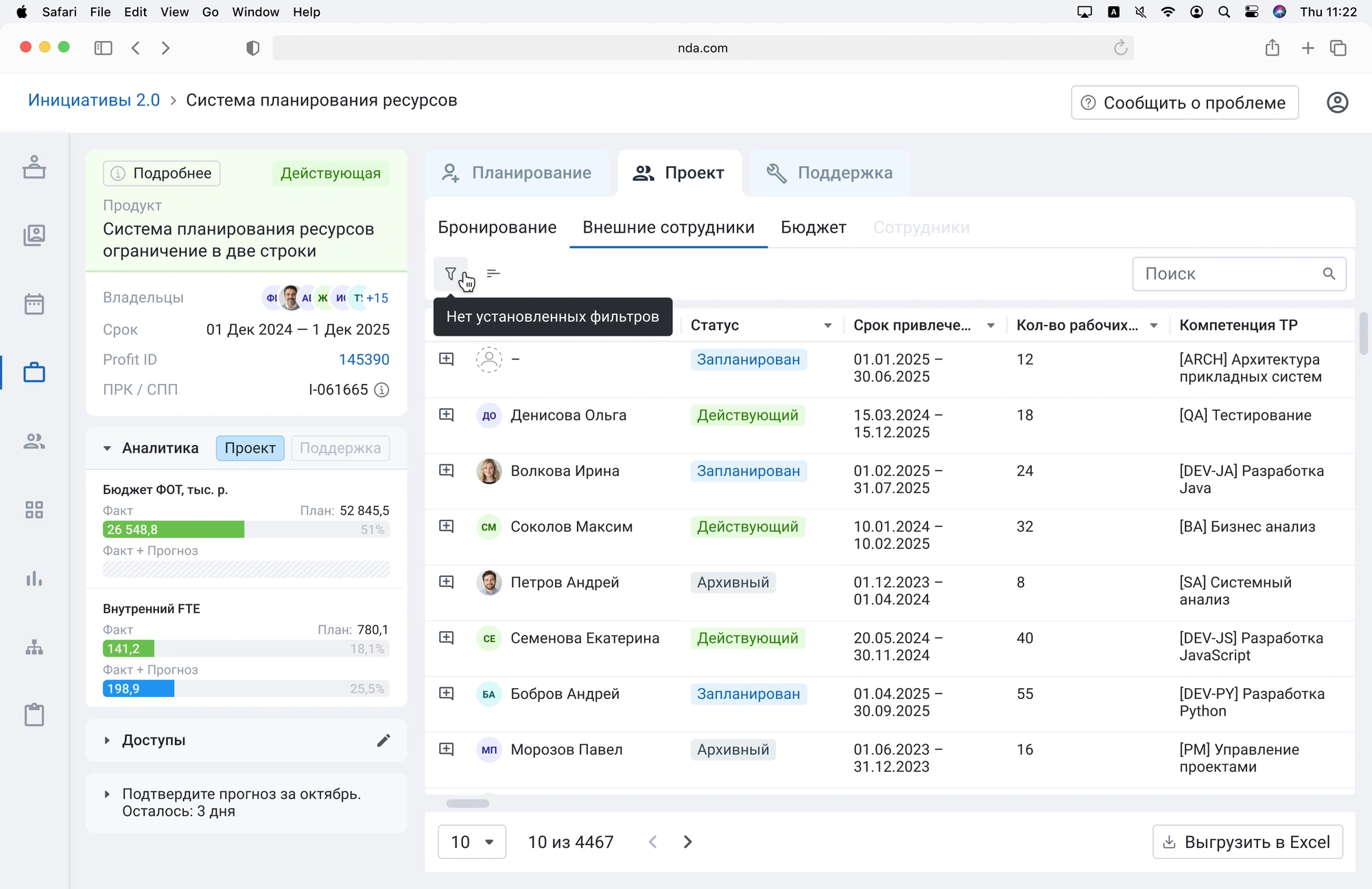
I owned the resource planning dashboard — redesigning a legacy, table-heavy interface that made it difficult to quickly understand staffing capacity, budget impact, and resource allocation
I worked directly with the Product Owner and analysts, owning design decisions across the dashboard and initiative details experience
Role — Product Designer
I designed the core resource management experience: employee navigation, advanced filtering and search, moving people between initiatives, adjusting FTE, adding and removing employees, and monitoring resources within each initiative
Process
Direct access to end users was limited, so I built an alternative validation loop with the Product Owner and analysts
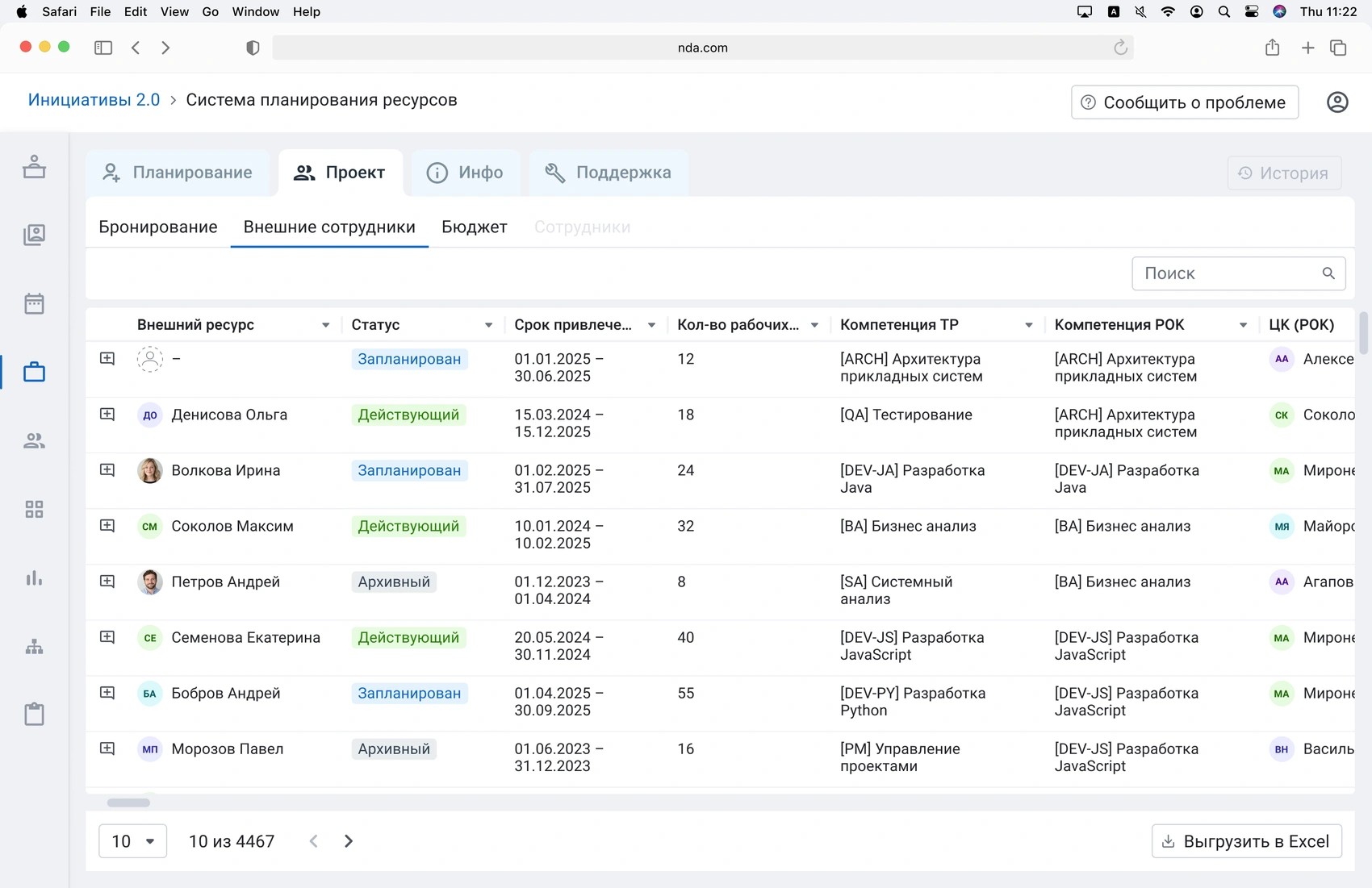
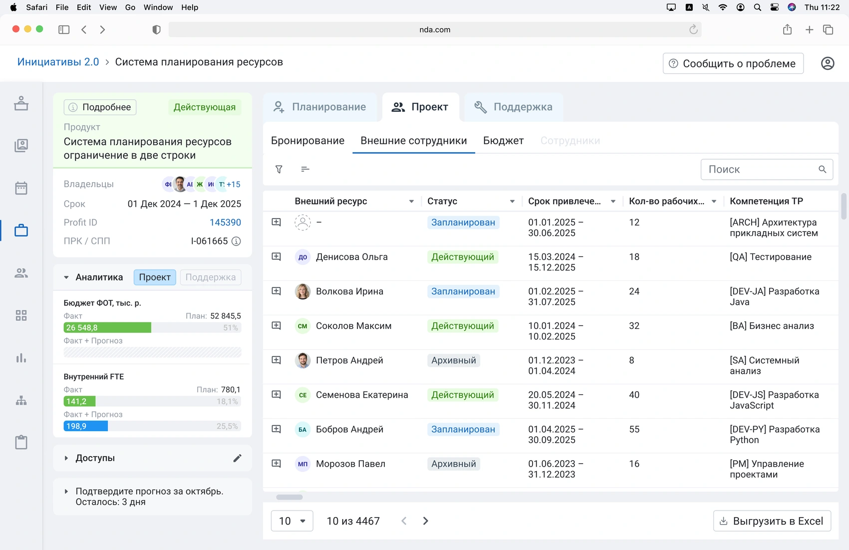
I prepared two versions of the interface:
What validation revealed
Since I couldn't interview users directly, the Product Owner facilitated the sessions using the scenarios and variants I prepared. The comparison showed a clear preference for keeping the summary visible while managing resources:
Users could make changes and understand their impact without leaving the table context
Key decision
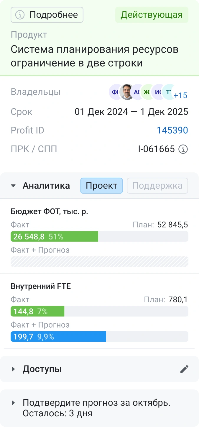
Based on the test, I brought the initiative summary — budget, available resources, and internal FTE — onto the same screen as the employee table instead of hiding it behind another interaction
This introduced a deliberate trade-off
The summary sits on the left, reducing horizontal table space instead of taking vertical space above it. Preserving vertical space meant keeping more employees visible at once, while the loss of horizontal space was mitigated by advanced filtering and search
More importantly, this created a closed feedback loop within a single screen
Users could change resource allocation and immediately see how it affected the initiative’s FTE and budget — without switching between views or losing context
Impact
Compared with the previous interface, testing with a control group showed:
- 23%
- less time spent on scheduling and segment management
- 40%
- fewer interface-related support requests
- 17%
- higher user satisfaction
[Results reported by the product team]